After we decided on which of Nathan’s concepts we all liked best, and settled on the turtle design, we then needed to draw out some poses in that concept’s style. I did this and took inspiration from dog poses as you can see below…


After we decided on which of Nathan’s concepts we all liked best, and settled on the turtle design, we then needed to draw out some poses in that concept’s style. I did this and took inspiration from dog poses as you can see below…
In the beginning when discussing the look of the house apartment, we said we wanted something clean and glossy but also warm and lived in. Shelley and Niamh looked at some examples as you can see below…

What i like about the image above is the outline work, it reminds me very much of ‘101 Dalmatians‘. I like the cluttered look of all the crockery yet the floor is still very clear and clean.


The two images above are of the same apartment but drawn in slightly different colouring and brightness, although both are lovely i actually prefer the one directly above this text, the rougher line work is something i enjoy.

This image is closer to the style we like in the film mentioned in a previous post “June: Life is better when you share the ride” I enjoy the blunt shapes seen the picture on the wall and the half hazard style of the bring work etc. I plan to use this image as a close reference when designing the apartment.


The two images above are drawings i did earlier in the week before we decided on the stylistic approach. I do still enjoy the style in the top drawing, and plan redesign and develop it in the new style.
We have already discussed the potential to make the turtle character more stylised and ‘boxy’ but below are my first concepts of the turtle, in some i tried to make him do ‘doggish’ poses such as begging, rolling over etc.
I did the most of these roughly in pencil in a sketchbook, this helps explain just how early these sketches are, and i am already working on the next version of the turtles style journey.


From the off set of this story being planned, we knew we wanted the house to look quite ‘american’ and most likely be in a cul-de-sac. This was the first concept i did, then realised i needed to concept more rather than just jump straight into colour.

I drew out these houses, i wanted them all to have a porch area, and that was what my concepts were based around. Since the story all takes place on the porch, i knew it needed to be a large enough area to have a seating area, this is what i came up with…

Once happy with my sketches, i began shading them in grey scale, the only colour i added was the green of plants, which some of the houses have more than others.
Each house i wanted to have a different style than the other. As you can see, some have a smaller porch, some have a porch that goes the whole way around the front of the house, some have an attic window plus the second story to the house.
Some have next to no plants, and some even have greenery growing up the house, i felt these smaller details can tell a lot about what kind of people live their, and how they feel about the upkeep of a home, which makes us consider why upkeep hasn’t been kept. Money issues? Family issues? Laziness? Depression?

After sharing these concepts with the rest of the group, i got feedback on what they liked about the houses. Which one is their favourite and why? I intend to now use this information to concept a ‘Super House’.

Since the majority of the story will take place on the porch, i decided to begin concepting what the porch might look like, what the seating wiil look like etc

Here are Julie and i’s final paintings representing Spring, Summer, Autumn and Winter in a ‘Food World’.

For my winter painting, i very much wanted to focus on the fact that it is Winter, so wanted to create something full of ‘ice’ and ‘snow’. I drew out the idea below having in mind that the ‘snow’ would be made from ice cream and the castle would be made from ice cream cones.

I began by painting the sky, a pretty natural blue with a sunsetting deep orange hue.
I then added in the sun, i wanted it to be ‘piercingly’ bright, the way you see in documentaries based in the arctic.

I then painted the large piece of ice/ice cream, my idea was for it to look like the image is looking out from a cave,so naturally there is much less light, meaning the cave is much darker. I wanted the ice cream to be strawberry, so thought it would be a much deeper ‘purple’ hue when taking into account the darkness of a cave. 
I finally added the snow/ice cream of the foreground in a light pink shade, as i stated i wanted it to be strawberry ice cream, but the more i look at it, it could be candy floss. I had wanted to paint in a few more ice cream cones or candy canes or even sprinkles, but with running out of time i thought it would be best to leave it as is and say that it is open to interpretation.

For the pumpkin painting i wanted to stay with the orange tones throughout the painting and not just in the pumpkins, i decided the best way to do this would be to block out colours before i painted in detail, as you can see i did with the ground and river in the images below. I had already painted the pumpkin house of one of the tree trunks at this stage.

As you can see this images i moved onto painting the smaller pumpkins and river/gorge area. I i added warm red tones and golden yellow ones this area and really like how it turned out.

I then painted the carrots, i decided to add carrots as the background looks a little bare, but wanted dot stick to the orange hues.

Here is the finish product…
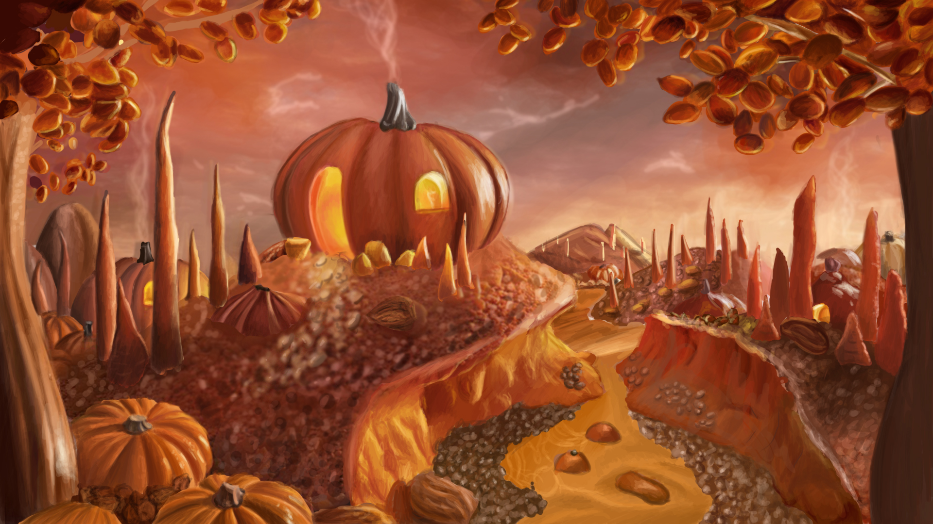
I am very pleased with how this turned out because i have never really painted scenery before as i usually focus on portraits.
However i do wish to state i did not come up with this design on my own, Although i did draw and paint it.
I feel this image describes autumn pretty well, did enjoy painting it and particularly enjoyed painting the pumpkins and the sky.
Before modelling, texturing etc could begin we of course needed to decide on the style of the film, and having a particularly artistic team we all created a lot of concept art, here is just some of the many images we created.
By myself

By Julie

By myself

By Julie

By Blaine

By Julie

By Niamh

By myself

By Julie

By Blaine


By Julie


By myself


After learning and struggling how to UV Map i decided to learn Z-Brush as i had found out from researching that if you export your model from maya and import it into Z-brush, you can then unflatten the model and get Z-brush to create the UV Map for you, then export model and map separately, paint the map and import the model into maya and assign the newly painted texture/material to the model. I found this so much easier and was able to paint the textures for the entire film this way.
Here are some of the painted textures before assigned onto the models


Mark Lisk and i stayed in uni for a whole weekend and i got all the textures painted and assigned into the film, we were then able to start preparing to animate on the Monday.

